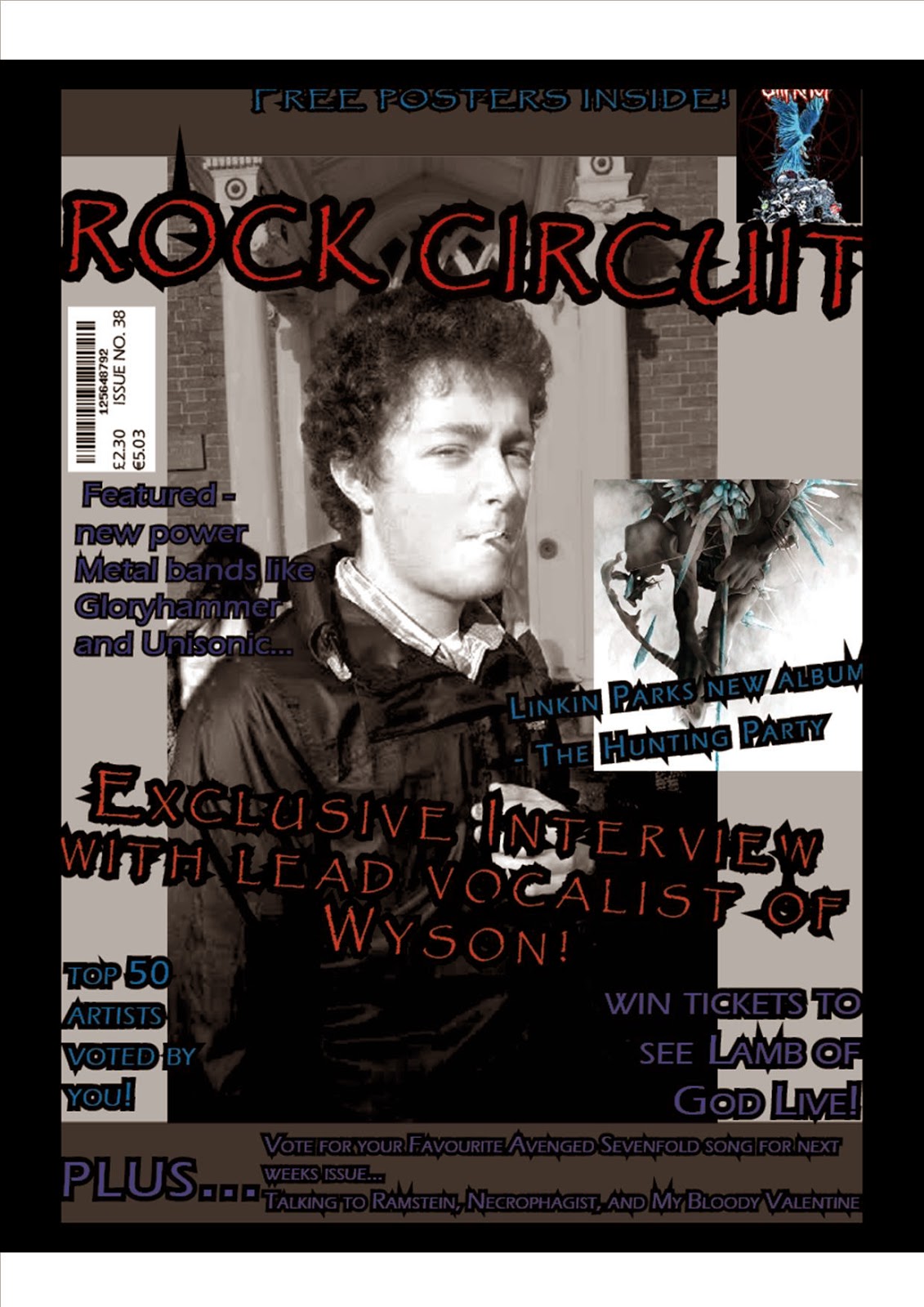
Friday 19 December 2014

Thursday 18 December 2014

audience feed back magazine update

 These are now the final pieces of my music magazine I have updated all of them according to the audience feed back I got (will be published later). I think they all show continuity, with the colours and fonts I've used. I think I've addressed all of the issues that I came across and over all it looks like a magazine of the rock genre. To improve it further I would maybe add a bit more to the interview on my double page spread, but over all I think its all complete.


Wednesday 17 December 2014

cover and double page spread update


 Both of these I believe are now finished, and show continuity, also it to me is clear what the genre is.
But I need to have some audience feedback to see if they can be improved further.
+

Friday 12 December 2014

Contents update

this will be one of my final updates on my contents page, I'm happy with how its turned out, and I've finally got my photos in. all I need now is to get some audience feedback on it.

Thursday 11 December 2014

Front cover update

This is the second edit of my front cover, I think that this is one of the better ones that I have come up with, because I think the colours work well and it has a good sense of house style, and this style continues throughout my magazine. I just need to put in my background photo.


This is of my last edits of my front cover (last will have image). I have changed the name of the band, and some of the content on it, as I thin the fonts were too big in the previous one, and it now looks slightly more professional. the only thing I need is my photo, and that will be acquired soon as the original image I was going to use didn't really fit it very well.

double page spread draft

Upcoming band Wyson are set to sweep over the nation with their first album, the Wyson EP; scheduled for release on February 20, 2015. Though recorded in mere weeks at a recording studio in Shropshire, the members are hoping that their audience will enjoy this album as much as their one off releases.
In an exclusive interview, we caught up with lead vocalist and guitarist George Woolford, to talk about their forthcoming album, and a few future gigs of theirs.

Hey George! What makes you think this album is going to be a big hit with the public?
“Well personally I think it’ll be a good seller because as well as our own songs which the band have written, we also have a few covers of the famous hits... But you’ll have to get the album to find out which ones. It’s all a bit nervy with the band at the moment, we just want it to be released, so we can see if the public do like it or not.”

If this album is a success, will you publish another?
“Defiantly! Even if it wasn't as popular as we thought it would be, I think we’d still make another album, which would hopefully be better than the previous.”

We've been told that you recorded this in a matter of weeks; do you think that this might have an effect on the songs?
“We all knew the songs really well, so when we recorded them it wasn't a surprise that some were finished fast, with only one or two retakes. Others were slightly more difficult, especially the covers… we wanted them to be as good as all our other songs and also as good and as effective as the original. I don’t really think that this will have an impact on the tracks, all of them have been refined and played well, so they should come out fine.”

You said the whole band helped write the songs, were there any major disputes among you?
“Yeah we all helped with the song writing, mostly I’d have a quick draft of a song then they would help me refine it and change certain parts if necessary. There were a few arguments over the lyrics, but it was resolved with a few compromises; but really if we hadn't have done this together the songs wouldn't be worth playing together either.”
Did any bands/songs influence you on the song writing?
“Well we really liked the style of songs from the American Idiot album, so we wanted to have that incorporated in to our playing, but we wanted it to be a lot more… heavy, if you see what I mean.”

On a personal note, you guys don’t really look like you play metal songs; is there a reason for this?
“Actually there is, we each have our own personal style, which is a mix of most things. What we wanted was to play heavy metal; but have the bands look contrast with that. This was mainly just to stand out from the other stereotypical bands, as most people have remembered us for this; which I’d like to think of as a good thing.”

You have some upcoming gigs too, right? Will any of your new tracks be on that?

“Yeah we've got a couple coming up for the Xmas holidays around our local area, there maybe one or two songs from the album, but we won’t tell you which ones... not yet anyway.”

Wednesday 10 December 2014

Pitch feedback

Do you agree with the both niche and broad genre I have chosen for my magazine?

  1.  I think that this would be a good idea as more people can enjoy reading about music that you might not have heard of before.
  2. This would be a good idea, but you have to make sure that you include plenty of niche genres/new bands etc. otherwise it'll be the same as most other rock magazines.

I think that it should have a chatty mode of address, would you agree?
  1. It would be good to make it chatty, then the audience can relate to it.
  2. I think it should defiantly have a chatty style as the audience wont want a boring list of facts and stuff.
  3. you may want too keep it a little bit formal with the structure, in case some people find it hard to read.

What do you think an appropriate price would be for my magazine?

  1. It shouldn't be to expensive as the audience probably wont want to pay a lot for it.
  2. I think it should try and represent however many pages you want to have in it, so it wont be overpriced.
  3. It shouldn't be anything over £2.50 as most people wont want to pay that much for a magazine.

Which colours would be suited to my magazine? 

  1. Defiantly dark colours.
  2. Mostly blacks, reds, and blues would look good.
  3. I think it should have dark colours, but maybe a few brighter colours so it looks more fresh. 

Friday 5 December 2014

contents update 2

this is the next update of my contents page. For this I've added some more content, and also a background,. Until I add my pictures, I'm not sure whether this would work or not; also a white background is more conventional than one with a coloured background.

contents update


This is the update of my contents page so far. I think the smaller font works better with it in the second picture, as it makes it look more professional than the first. I may add a background to it later and there should be images to go on it too :D

Thursday 13 November 2014

magazine update


The feedback I have received show that my front cover is appropriate for my target audience, has good cover lines, good register, and a variety of fonts and sizes.
To improve, I would defiantly take some photos and put them in, then decide whether anything else needs changing. then I have also started my contents so I'd have all the photos sorted for that too. Apart from that I think that everrythings good :D

masthead ideas


These are the four different fonts that I have chosen for my masthead. I have chosen to use the second one in my music magazine, as I think it shows off the rock genre the best (in those colours too). Also I'm going to use the third font for my coverlines, as its still bold, but doesn't distract too much from the splash etc.

Contents analysis

Pitch

Friday 7 November 2014

photography ideas

Ian - Kerrang! - lostprophets Photo
NME Double Page

I've been researching magazines like these and the style of photography would be suited for my magazine. I think having one person or group of people as the central image/background would be good as that would then show the reader straight away what the main story in the magazine will be about.
If I was to just have one person on the cover, then I would have more of a selection of secondary images (like in the issue of Kerrang). A similar idea will be used for the double page spread but more likely I will have to have a group of models for the background, and the interview below the picture. But like with Hammer, I would have a focal colour and possibly edit that in to the image, so its more consistent.

I would prefer the shot type to be a medium close-up for the front cover and contents page, but for the double page spread I think a medium long shot will work better, as then you can see more of the 'band' the models will be portraying.

Thursday 6 November 2014

Serif & Sans-Serif

Serif is a typeface that has a bar or foot at the end of the stroke/symbol


Sans-Serif is a typeface that does not contain a bar of foot

Wednesday 5 November 2014

time management

I am mostly up to date with my work, I just need to upload it as it hasn't for some reason unless it is typed on to Blogger.
The things I'm behind on are some of the things for the 20th of October, like a summary, and style sheet, but I should hopefully have this completed over this weekend then I should be on time for the rest of my work.

Action plan

October:       Intro
                      Initial ideas
                     Research
                     double page & contents page analysis
                     Develop pitch
                     Pitch & audiences
                     mock ups
                     planning for production

November:   Indesign/ps training
                      Designing front cover
                      designing contents
                      designing double page spread

December:    feedback
                       finalize
                      evaluation prep
                      evaluation

Monday 20 October 2014

Intro to main task

Main task - the front page, contents, and double page spread of a new music magazine.
All images and text used must be original, produced by the candidate. (minimum of 4 images per candidate.

Analysis x2 contents pages


Thursday 16 October 2014

Wordle


Music magazine collage


Initial ideas
Genre
  • The genre of my music magazine will be Rock music.
  • This is a broad genre so I can include     many different artists of all the different subgenres of rock.
House style
  • Mature
  • Dark and some bright colours
  • Bold fonts
  • Consistent fonts
Typical content
  • Lists (top 100 etc.)
  • Interviews
  • New music
Audience (niche/mainstream)
  • More mainstream, but with a few specialized aspects
  • Teenager to young adult
  • 16 to late 20’s
Type of institution that might produce the magazine
  • Professional
  • Globally known
  • Also owning several other magazines
  • They have the money to pay for the interviews, and stories
Mode of address
  • Mostly informal
  • Some serious aspects
  • Chatty to engage the reader
Representation
  • Some mainstream values

Thursday 9 October 2014

Evaluation

In what ways does your media product use, develop or challenge forms and convention of real media products?
Before designing my magazine, I looked at a few other student magazines; I found that the magazines I looked at, all had some similar features and themes. Most student magazines featured a central image of a student, who would have been around about the same age as the target audience.  Most commonly, three colours are includes to generate a vibrant colour scheme, which would connote energy and youth. The mode of address should be informal in order to relate with the target audience of students. The layout and masthead were plain, which connotes maturity, but it is easily recognisable, which would help it gain popularity.
In response to what I found, I chose two main colours to use, blue, and black which were used to create my house style which were in keeping with the convention of student magazines, and I also used red for some of the coverlines. I also took photos of some students, who were the same age as my target audience. I used a medium close up shot (which was part of the brief) I think this added some more detail and character to my front cover. I chose the name of The Student Circle for my magazine this made it certain that the magazine was designed for students. I used a simple font for my masthead as I wanted to connote maturity.

How does your media product represent different social groups?
I chose my target audience of both male and female students, from the ages of 16 to 18. From completing my research I found that students didn't want to pay much for a student magazine, or that they didn’t want to pay anything at all. So taking this in to consideration I chose to make my magazine free. My colour scheme and house style represented students of both genders, as it is quite simple and fun, the blue makes it look fresh, and the black is bold and attention grabbing.

What kind of media institution might distribute your media product and why?
I thought that the magazine would be available in college, and possibly universities; as the magazine would contain useful information about student life. The magazine is free, meaning it would appeal to most students who are interested in revision help, music charts, and student life.

 Who would be the audience for your media product?
The target audience for my magazine would be students between the ages of 16 to 18 who are interested in social events, tips on student living, and the latest gossip.

How did you attract/address your audience?
I attracted my audience by using a large image on the cover page, which is relatable to students taking exams. I used a bold font for the masthead, so that the magazine name would be clear, and recognisable, I used black text outlined with blue, which looks fresh and simple. For my cover lines I used a different font which was slightly bolder, and I outlined it in red, this helped highlight each cover line, so that the reader can see what coverline goes with the image. I used the same fonts on my contents page which added continuity to the magazine. The fonts used are clear and easy to read.

What have you learnt about technologies from the process of constructing this product?

To create the magazine cover and contents page, I used InDesign. InDesign was a completely new programme to learn to use, but after a while playing around on it I found it quite easy to use, and effective for what I wanted. I used different layers to add single images, and text boxes to allow me to move, delete or add new things as my magazine started to develop. I have learnt a lot about how to use InDesign which will be very helpful when producing my music magazine for the main task.

Contents Final


Thursday 25 September 2014

Research, Target Audience

I asked three students what they thought a the magazine should be like, this is what they said:

What kind of title should it have?


  • "It should have a large title as that's what you see first".
  • "Bold and bright colours always catch my eye".
  • "It should be student related, then it would be easy to find". 

Layout

  • "An image should be the main part of the cover".
  • "The cover and contents page should be easy to read and follow".
  • "I think it should still have bold colours, but not to much of it on the main articles, it would be too distracting".

Content

  • "It should have student related stories".
  • "A gossip column".
  • "Defiantly something students can relate to".

Price


  • "Free".
  • "I don't think I could afford to buy it every month, so I think it should be free".
  • "Should be free".


Initial Ideas


Colour schemes and fonts


Thursday 18 September 2014

Introduction


I'm going to be making a front cover and contents page for a student magazine. 

Week 1: 

  • Research and planning. 
  • Analysis of magazines and how they target audiences.
  • Research of target audience. 
  • Planning for production.


Week 2: 

  • Production.
  • Photo shoot.
  • Design front cover.
  • Design contents page.


Week 3:

  • Production.
  • Design contents page.
  • Evaluation.


Week 4:

  • Evaluation.